Data distribution is simply the way data values are spread out, or distributed,
within a given data set. Various representation methods, such as charts, tables, histograms, box plots and dot plots, can be used to display the distribution of data. Such methods present the unorganized (raw) data in a more readable fashion, which can be more easily interpreted.
We will be looking at three categories in which organized data distribution will be used:
• the center value of the data set,
• the spread of the data elements,
• and graphical shape of the data.

 Center Center |
A measure of center (or measure of central tendency) is a value that attempts to describe a set of data by identifying the central position of the set.
As you know, the "center" of a set of data can be determined by calculating:
• the mean (the average of the data)
• the median (the middle
number in an ordered data set)
|
|
See more info at Measures of Central Tendency and Measures of Center.
Spread |
The measure of spread (or measure of dispersion) shows how the data elements are arranged across an ordered data set, in relation to the center of the data.
It shows how far the data elements are away from the mean or the median.
The "spread" of a set of data can be examined by calculating:
• the range (difference between the largest and smallest data values)
• the Interquartile Range (IQR) (difference between the 3rd and 1st quartiles)
• the standard deviation (a measure of variability)
|
|
 When dealing with range, you are dealing with the simplest measure of spread.
While being simple to compute, the range is often unreliable as a measure of spread,
since it is based on only two values in the set.
Note: We will concentrate on Interquartile Range and Standard Deviation as "spread",.

When dealing with Interquartile Range (IQR), you are dealing with quartiles.
Let's refresh our skills on quartiles.
| Dealing with Quartiles and IQR |
A median divides a data set into two equal parts.
That set can be subdivide further into four equal parts, by values called quartiles.
The quartiles are like additional "medians" of the lower and upper halves of the data set.
The quartiles divide the data set into quarters,
with each quarter containing one-fourth (or 25%) of the data.
A quartile is a number, it is not a range of values.
Data can be described as being "above" or "below" the first quartile,
but data is never "in" the first quartile.
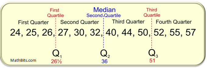
Q1: The first quartile is the middle (the median) of the lower half of the data set. One-fourth (25%) of the data lies below the first quartile, and three-fourths (75%) lies above. |
Q2:The second quartile is another name for the median of the entire set. One-half (50%) of the data lies below the second quartile, and one-half (50%) lies above. |
Q3:The third quartile is the middle (the median) of the upper half of the data set. Three-fourths (75%) of the data lies below the third quartile and one-fourth (25%) lies above. |
The difference between the third quartile and first quartile is called
the interquartile range (IQR).
The interquartile range (also called the midspread or middle fifty),
is the distance between the third and first quartiles
and is considered a more stable statistic than the "range" of the set.
The IQR contains 50% of the data.
|
For the example shown above, the IQR = 51 - 26½ = 24½. |
It may be the case that a data value falls well outside the range of the other values in the set.
Such data values are called outliers (as they "lie outside" the other values) .
We will see, later on this page, that outliers may lead to false impressions regarding the distribution of a data set.
Formula for Determining Outliers with IQR:
Outliers are defined as those data points that fall more than a specified distance from the first or third quartiles.
That specified distance is 1.5 • IQR
(one and one-half times the IQR).
|
Outliers are:
greater than Q3 + (1.5 • IQR)
(referred to as the upper fence)
or less than Q1 - (1.5 • IQR)
(referred to as the lower fence) |
|
| Data points that fall to the far left, or far right, of an ordered data set should be tested as possible outliers. |
Read more about IQR and outliers at Box Plots.
When dealing with standard deviation, you are dealing with the spread
of a group
of numbers from the mean. It deals with how far the numbers are away from the mean.
If the standard deviation is high (a larger number),
the further the data points will be from the mean,
signaling more spread to the data.
If the standard deviation is low (a smaller number),
the closer the data points are clustered to the mean. |
The smaller the standard deviation, the more consistent the data.
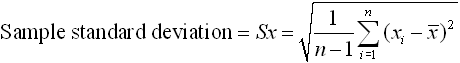
| Standard Deviation Formulas |
 Note:
Note: NY NGMS will focus on the "
Sample Standard Deviation".
These formulas can look pretty messy, but don't worry.
Your graphing calculator is going to do all of the heavy lifting for you.
The formula for standard deviation is actually the square root of a another type of "spread" called the "variance". The "variance" is the average of the squared differences from the mean.
| FYI only: To find the "variance":
• subtract the mean,  from each of the values in the data set, xi from each of the values in the data set, xi
• square the result
• add all of these squares (the sigma notation for "sum" is used in formula)
• average = divide by the number of values in the data set. (population, n; sample, n - 1)
|
Standard deviation is the square root of the variance.
Standard deviation is a way to describe the difference between the mean
and the values in the data set without worrying about the signs of these differences.
These values are usually computed using a calculator.
Read more at Standard Deviation and Calculating Standard Deviation.