|
|
A scatter plot is a graph of plotted points that shows a relationship between two sets of data. Scatter plots are composed of "dots" (points) on a coordinate axes. Do NOT connect the dots in a scatter plot! |
The data in a scatter plot is quantitative data (meaning it consists of numbers),
and it is referred to as bivariate data (meaning it is working with "two" sets of data).
Statisticians and quality control technicians spend a good deal of time gathering sets of data to determine if relationships exist between the sets. Scatter plots are a popular and effective way of graphing data to display patterns, trends, relationships and an occasional extraordinary value located apart from the other values. Let's see an example.

Does studying for that Final Exam really help your score?
Does
one event really affect the other? |
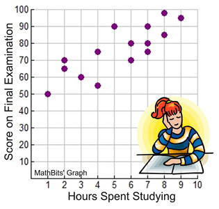
The data in the table at the right shows the data for fifteen students as to their Final Exam scores and the number of hours they spent studying for that exam.
The scatter plot below displays this data. Notice how the plots tend to increase (go up) as you read across the graph from left to right. This plot appears to show that the longer students studied, the higher their examination scores. That is, as the hours spent studying increase, so do the scores on the final examination.
For this particular set of data (and these particular students), it appears that the answer to our initial question is "yes", studying does affect your score.
|
Student |
Hours Studying |
Final Exam Score |
1 |
1 |
50 |
2 |
2 |
70 |
3 |
2 |
68 |
4 |
3 |
60 |
5 |
4 |
55 |
6 |
4 |
75 |
7 |
5 |
90 |
8 |
6 |
70 |
9 |
6 |
80 |
10 |
7
|
75 |
11 |
7 |
80 |
12 |
7 |
90 |
13 |
8 |
85 |
14 |
8 |
98 |
15 |
9 |
95 |
NOTE: A scatter plot is not necessarily a function. It is often the case where the same x-value may have more than one corresponding y-value, such as (6,70) and (6,80). |
Clusters in Scatter Plots |
There are some scatter plots where the data is not so much "scattered" as it is "clustered" together. In these graphs, the data points will appear to form "groups" in a specific location, or pattern, on the coordinate grid.
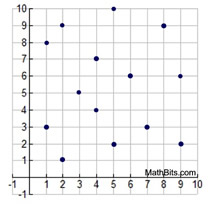
The plots in this graph are truly "scattered". There is no pattern, or trend, as to where the data is located as you read the graph from left to right.
|
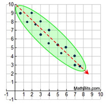
The plot in this graph can be described as being " clustered" along a decreasing straight line, as you read the graph from left to right.
The most common type of "cluster" we will be seeing. |
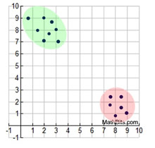
The plot in this graph can be described as being "clustered" in two locations. The points are arbitrarily grouped in two areas of the grid.
|
Example 1: Data regarding a group of students shows the association between the time they studied and how they scored on the final examination. This scatter plot of the data shows the points "clustering" around a straight line indicating that longer these students studied the better they scored on the test.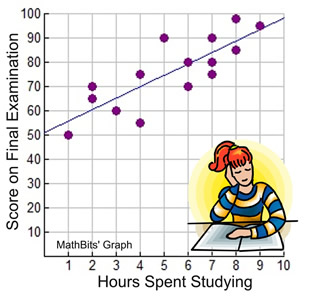 |
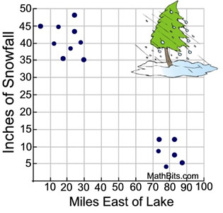
Example 2: A lake effect snowstorm blew across Lake Ontario and dumped record amounts of snowfall on the surveyed cities and towns east of the lake. This scatter plot shows "two distinct clusters" of cities and towns based upon the amount of snowfall they received. (This example does not show a clustering around a line.)
|
Outliers in Scatter Plots |
Most of the scatter plots we work with display some pattern, such as clustering around a straight line. A scatter plot outlier will be a data point that does not appear to fit the pattern.
Unlike "outliers" that we saw in box-and-whisker" plots (box plots), outliers in scatter plots will not be associated with a formula for ensuring that they are "true" outliers. At this level, when working with scatter plots, outliers will be determined by observation only.
Example 1: This scatter plot shows a pattern of the test scores increasing as the hours of sleep increases. The pattern clusters a straight line increasing from left to right across the graph. The red point (9,60) is not following the pattern. Therefore, (9,60) is considered an outlier for this scatter plot. Some poor student slept for 9 hours but failed the test with a score of only 60.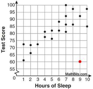 |
Example 2: A research team hikes into a forest looking for a specific fern. As they hike deeper into the forest they find fewer specimens. The number found follows a pattern of a decreasing line as they go deeper into the forest.
One group finding only 10 ferns on day 3 could be called an outlier. Also, another group finding 50 ferns on day 6 could also be called an outlier.
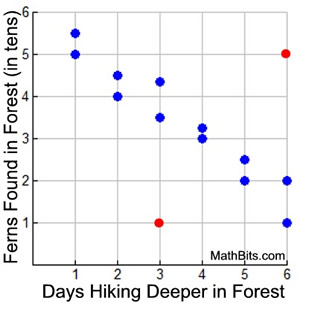 More than one outlier is possible.
|
An outlier is not necessarily a "bad" point. Sometimes an outlier may point you in the direction of something beneficial. Consider this situation:
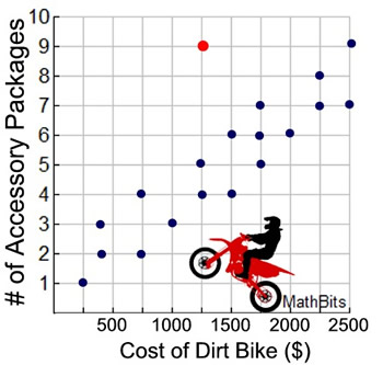
Example 3: A survey is conducted of dealerships selling dirt bikes to determine how the pricing is connected to the number of desirable accessory packages that are included in the pricing.
After plotting the data in a scatter plot, it can be seen that a pattern emerges, As the cost of the bike increases, so does the number of accessory packages connected with the price.
The data is clustering around a straight line which increases (goes up) from left to right across the graph.
There is ONE outlier at point (1250,9). This outlier shows that if you are buying a dirt bike and you are interested in getting as many accessory packages as possible for your price, then the dealership associated with plot (1250,9) will offer the best deal. |
 |
NOTE: The re-posting of materials (in part or whole) from this site to the Internet
is copyright violation
and is not considered "fair use" for educators. Please read the "Terms of Use". |
|